Music Friday: Breathturn by Hammock

Where did the week go?? I mean honestly. It few by. Which is good I guess. There was a post on Ryan Ball(fantastic work there), I joined twitter(which could be fun) and now we have an absolutely beautiful song/film by Hammock. If you're reading this, you have to, need to, will not regret... watching this 6 min film. I watched it, then thought about watching it again for at least a minute (there was also a wow factor in there too), then watched it again. So I spent a total of a quarter of hour watching it and I don't regret it at all because it's amazing. The original post is here. Which states:

"Breathturn" from the album "Chasing After Shadows...Living with the Ghosts" to be released on May 18, 2010. Directed by David Altobelli.

So hopefully I know what you're going to be doing for the next 6 minutes. I'm tellin' you, awesome...

Hammock - Breathturn from David Altobelli on Vimeo.

Anyway, super stoked about the album and this film gives me a lot of hope for art and the future of short films. And yes. I just watched it again (last statement to be read as: I've spent a total of at least a half an hour watching it). Amazing. David altobelli is the man and has a few more videos on his vimeo page. There's also a cool little VFX piece put to the awesomeness of M83 We Own The Sky. And while I'm at it Hammock has a Facebook page. All around, really inspired stuff.

But(!) it's the weekend so have a good one out there. I don't know where you are but it's supposed to gorgeous here so that means it's time to get outside a bit. A little run by the lake, I think so.

Be safe out there.

Artist: Ryan Ball [q&a]

What a great honor to start off the week again with a featured artist. Again, I had the pleasure of meeting Ryan and discussing his work a bit in person. Furthermore, he was also kind enough to answer a few of my questions and allowing me to post the responses on the IUBlog. Ryan Ball is a really great guy making some really beautiful and inspired work. I spoke to him mainly about his series Hurry up and Wait but he has several other bodies of work up on his site so make sure you stop by and check it out. His artist statement for Hurry up and Wait:

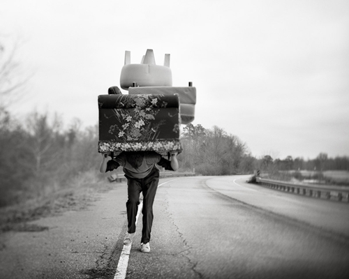
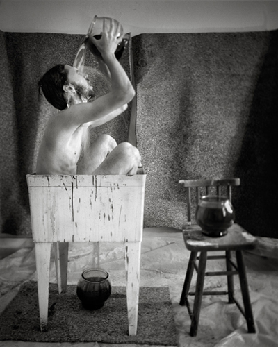
In this photographic series, Hurry up and Wait, I am illustrating the mental struggle that one experiences during simple repetitive tasks. My interest with humans’ affinity for boredom comes from my own unrealistic lack of patients and an incessant urge to keep in motion. Repeated failures and unwavering daily routines fuel me to express bottled up frustration by creating universally accessible images.

presents

[me] When you first started this work, when and how did you decide black and white would best communicate your idea?

I started into this work with intentions to shoot monochromatic film with the 4x5 view camera because I knew the power that certain color palates have on the emotional interpretation of art works and I wanted to minimize those variables and concentrate on lighting and tonality. More importantly, I felt that working in black and white complimented my intentions to create timeless spaces that are absent of contemporary references.

moving

[me] Your austere environment hints at a modern world yet the notable absence of technology creates a apparent tension between what we see and what we know, can you elaborate on your choice (or a choice) of visual signifiers (or a visual signifier)?

[ryan] I chose to limit the presence of technology and instead employ physical activities to further the underlying theme of futility in my work.

The fact that technology exists to push water out of a shower head or move furniture from place to place is the very reason why it is absent in these images. Knowing that viewers will pick up on this tension will hopefully solidify the notion that my character is working against the world. This series, Hurry Up and Wait, is an exploration of human nature, touching on the idea that there is always something better around the corner and I find myself constantly taking one step forward and two steps back as a direct result of my own ambitions. This work displays an environment devoid of helpful devices which sometimes complicate life as much as they intend to simplify as we sometimes do in everyday life.

[me] Your work in the series "hurry up and wait" comes from a very personal place, the images and performance work together to create a deeply compelling series, has this led you to any new personal discoveries or in turn influenced other work in new ways?

[ryan] Working on this series has been extremely helpful in my outlook on the way I live along with putting my life under a microscope and exploring all of my frustrations and fascinations with physical activities. Having to be creative in devising counter productive problem solving techniques like in the image with the cinder block has inversely improved my productive behaviors in life. I am also more aware the creative methods of others and gaining insight on how our world is truly held together with duct tape and string. I find more and more that random objects interest me like they would interest McGyver in a life or death scenario. I was just about to mow the lawn and I fell in love with a patch of weeds.

[me] What's the current format of the series? Where can we see it?

The exhibition size is 16x20" Archival Inkjet Prints matted in 20x24" frames. About 10 images from the series will be shown in the Senior Photography Exhibition at the Enterprise Center in Ruston, Louisiana with an opening reception on April 30th at 6:30PM to 8PM. The series is also on my website ryanballart.com along with work from other projects.

Really great stuff. Again, huge thanks to Ryan for wanting to be apart of my discussion series.

More to come so check back later...

Cheers.

Epic Music Friday! The Candle Thieves, Jonsi, Two Door Cinema Club and Kyte

Things have been extremely busy behind the scenes here at IconBlog. However I came across some fantastic videos for some tunes I've been diggin' as of lately. I've got three four for today and if you have the time check out all of them. Also if you have the time scroll down the blog to see some of Christin Boggs work (or just hit the link and go to her site, you choose). Like I said earlier this week, great stuff. And check back next week for Ryan Ball's work and another q&a. Until then here's what I've been diggin' this week, and now that I see what I'm going to post, it's all over the place...anyway, enjoy!


TWO DOOR CINEMA CLUB | SOMETHING GOOD CAN WORK

TWO DOOR CINEMA CLUB | MySpace Music Videos

Artist: Christin Boggs [q&a]

Another week started and another interview to accompany it. While at SPE Philadelphia I had the wonderful chance to meet Christin Boggs. We talked briefly but I really became interested in her work. I mentioned that I was looking to write about as many people as I could and she said she would be happy to answer some of my questions. But first a little background from her website:

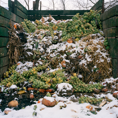
A native of Northern Virginia, and alumna of George Mason University's Art and Visual Technology program, Christin has been studying photography since her sophomore year of high school and is currently pursuing a Masters of Fine Art at Rochester Institute of Technology. Informed by the writing of such authors as Michael Pollan, Barbara Kingsolver and Wendell Berry, Christin's work is centered on a critique of the processed foods of the American diet, along with the exploration of natural eating habits.
brusselsprouts

Q&A

[Me] As a life long vegetarian i have a particular interest in food, where did your inspiration for the project originate?

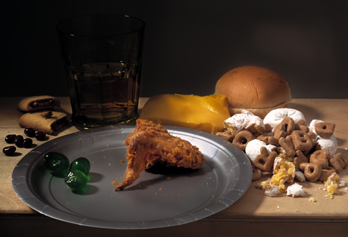
[Christin] I've had a long-time interest in nutrition, which was originally based on the food pyramid, a proper balanced diet, and avoidance of harmful ingredients like MSG, regardless of food origin. It's taken me a long time to figure out how to eat alternatively to the mass-production grocery store mentality. While studying photography as an undergraduate at George Mason University, I began to experiment with ways in which to address food issues in my art. Currently in my second year of Rochester Institute of Technology's MFA photo program, I have continued making work centered around food issues, which first led to "Cheap Fix," a series of five photographs replicating Dutch still life paintings. Rather than creating an exact replication, I replaced each object from the original painting with its contemporary counterpart. For example, artisan cheese and bread were replaced by Wonderbread and Velveeta Cheese and glass tableware was replaced by plastic tableware.
stilllife

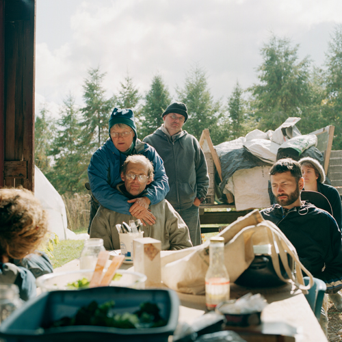
All of my previous food photographs dealt with a critique of the American food industry. During my first year of grad school, I read Barbara Kingsolver's book Animal, Vegetable, Miracle (http://www.animalvegetablemiracle.com/), which totally changed my way of thinking about food by introducing me to the movements of Slow Food (http://www.slowfood.com/) and local food. I began making small lifestyle changes, like baking my own bread and shopping at the farmers market. So with a background interest in food issues, the inspiration for "Slow & Steady" really grew out of a desire to meet people in the Rochester area with similar food interests and to continue learning how to eat closer to the source.
potluck

[Me] I feel there is a substantial amount of research that exists outside the images - if so, do you plan on showcasing that information?

[Christin] Absolutely, there's a lot of information contained within the project that I want to share with viewers in a few different ways. For my thesis show, in addition to the images on the wall, I am planning to have a reading area within the gallery which will have books and articles pertaining to the local foods movement, in addition to information for Rochester residents who are looking to get connected with local farmers, small-scale food producers and community gardens. I am also considering a website dedicated to the project, which would have links to a lot of my research sources. And ideally a book would be a great way to include some text about the images.

[Me] There is a particular color pallet that accompanies your images, is this something you discovered along the way or selective characteristic chose to emphasize?

[Christin] I did anticipate an overall muted color palette, because the subject matter is so close to nature, in contrast to projects like Susana Raab's "Consumed") and Brian Ulrich's < href="http://notifbutwhen.com/projects/copia/retail/">"Copia", in which photographs contain bright fast food labels. Also, I've been photographing since September, when plants were just beginning to wither and Rochester weather was becoming colder, bringing gray skies and flat lighting.
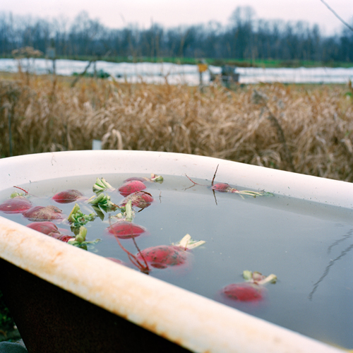
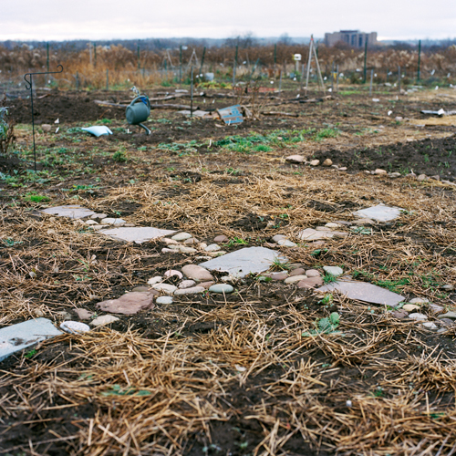
turnips

stones

[Me] Where do you hope to take this work?

[Christin] Short-term, "Slow & Steady" will be shown in October, at the Rochester Regional Community Design Center (http://www.rrcdc.org/), as my MFA thesis show. It's exciting first to show the project within the Rochester community. But outside Upstate NY, the project acts as one example to the larger slow foods movement. The images are versatile, walking a fine line between documentary and fine art imagery, so the possibilities are wide open. Aside from showing in galleries, I'd love to see the images in print in magazines like Orion or Daylight and exhibited in public spaces such as libraries, city halls, schools, etc. After each shoot, I provide food producers with digital copies of photos and welcome them to use the images for promotional purposes, so the photos have been ending up on blogs, Facebook, newsletters, etc.
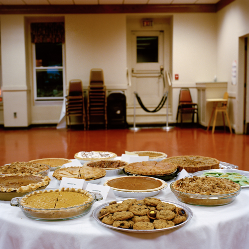
pies

So there you have it. What a great chance to look a little closer at fantastic some work being created. I'm honored to include a discussion of this nature on this blog. As it was noted in the beginning, I'm a lifelong vegetarian, so hearing/reading the answers to some of the questions were of particular interest to me. And not to mention photographically wonderful. Make sure you check out Christin's site more more images. Her blog is first rate as well.

A little more to come this week, however things are shaping up to be on the busy side but the next interview featuring Ryan Ball, just off in the future, probably next Monday.

Cheers.
Friday Distraction: Slow Motion Surfing

It's been a busy week on the IconBlog...from postings announcing the format change to wordpress to the release of the first artist interview featuring Daniel George...time is short indeed. I couldn't decide on a tune to post this friday because this week turned out to be pretty much "epic" in terms of fresh stuff but I did stumble across this awesome slow mo shot from BBC Two that I wanted to get out there. I'm a sucker for super slow motion photography so naturally I was taken by it. Doubly so because it deals with surfing which someday I hope to try. The whole segment makes me think of summer too and that's never bad. But check it out if you have 2 min. Someday I'll film something like this. I've got all sorts of tricksy ideas for slow mo and I know the BBC is going to call me to put those into production...right BBC? The line happens to be free, you should call now BBC. Anyway, just check the clip...

So awesome. Have a safe weekend out there.

Cheers.

UPCOMING: Look back next week for interviews featuring Christin Boggs and Ryan Ball...two artists doing fantastic work.

Photographer: Daniel George [q&a]

I had the pleasure of meeting Daniel George at SPE Philadelphia. We talked for a bit and he was kind enough to answer some questions about his work for this blog. His work is quality all around so make sure you stop by his site to see more of it.

His Artist Statement for Introducing Nature:

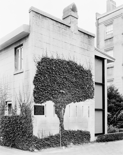
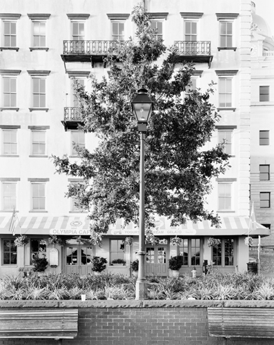
Introducing Nature is about the quirky ways nature is incorporated into urban environments. Trees grow out of squares cut in the sidewalks, hedges form geometric shapes, and potted plants stand isolated against cold, cement backdrops. There is a strong contrast between the geometric and the organic, the man-made and the natural. But we have grown accustomed to this polarity. We enjoy our parks that fit perfectly within the city grid and the orderly rows of trees that line our streets. These photographs do not delineate a battle between opposing forces – man vs. nature – rather they present amusing examples of how we maintain a close relationship with the environment. There is an apparent visual awkwardness to nature in unnatural places, yet that is how we preserve it in our urbanized surroundings.

vinetree

Q&A

[Me] To me I find an interesting conversation between "our responsibility" in terms of preserving nature and reintroducing nature into developed areas, do you feel that contemporary architecture is accommodating a new role in incorporating nature?

[Daniel] These days I do think that contemporary architecture is trying in more ways to incorporate nature in response to conversations on sustainability and green living. It seems that more people are recognizing the need to maintain a balance with nature, and as a result, are designing ways to include it in even the most developed urban areas. A good example of this is the High Line in New York City, where they basically converted an abandoned railway into an elevated, public park. It is amazing.

[Me] In the world of man and nature do you feel your images are confronting "visual awkwardness" or emphasizing it? To what ends to you hope to achieve though your interpretation?

[Daniel] I would say that my images emphasize visual awkwardness. I generally look for scenes where nature appears out of place, and then I try to push that odd relationship even further. I want to create a lighthearted sort of tension within the photographs—between the subject and the environment. I pay a lot of attention to the placement of light poles, power lines, windows, and other supporting elements in order to do this. I am interested in communicating my sense of humor, which I admit can be a bit dry, by emphasizing some silly detail that might normally be overlooked.

treeandlamppost

[Me] Your choice of using black and white seems at odds with the inherent qualities of "greenery" in our world, can elaborate on your motivation behind using black and white?

[Daniel] My main motivation in using black and white was to maintain a clear, precise emphasis on form. One artist whose work I looked to early on was Charles Sheeler and his photographs of the Ford Motor plant, which are visually all about the shapes of industry. It seemed to me that the best way to show contrast between organic and geometric shapes in my work was to eliminate color and focus on form. I found that color worked in my images sometimes, but that it was too distracting for the majority.

treesandlightpole

[Me] How are you planning on presenting the work? Large installations? Intimate prints? Or something else entirely?

[Daniel] For presentation, I prefer a more intimate print size—16x20 at maximum. I think my images lend themselves to be examined closer up, that way the sometimes, subtle addition of humor won’t be overlooked. However, my final goal for this project is publication, but that is a bit further off in the future. Right now I am just practicing by creating small, limited edition runs of magazines and selling them through my blog (photogeorged.blogspot.com). I am hoping that I can distribute copies, receive feedback, and save the earnings to help with the costs of book publication. Also, as a fun promotion I added a Golden Ticket to five of the fifty magazines—redeemable for a free, signed print. I wanted to do something fun in appreciation for the people interested in my work. Three tickets remain, just in case anyone was wondering.

So there you go. A little bit more about Daniel George and his work. I hope to continue this series a bit more over the next couple of weeks from people I met at SPE. So if I did meet you and we didn't exchange info drop me a line and I'll still get your work in there. Huge thanks to Daniel George and again, make sure you stop by his site.

Cheers.

Posts to Continue!

RIPblogger

On Tuesday, January 29th 2008 I thought I had solved all my blogging issues. But sadly things change and solutions age before the problem dies away and what was my problem free blogging platform turned into/became/was a vastly different issue.

Blogger's choice to discontinue ftp publishing is both a sad one and a problem to me seeing this is how I publish all things art related. So in pursuit to continue to publish via ftp has led me to use wordpress. Which I don't have a problem doing so but that means that all my old content now has to exist as a separate page here. Sad I know but this will hopefully be for the better. There are several articles on migrating the old blog to the new wordpress site but I for the life of me could not get it to work...anyone successfully accomplished this?

I probably should have used wordrpess from the start but all the database construction gave me a headache. Turns out it wasn't that bad. But the good news is the IconUnited Blog is now back up and running. Posts shall flow freely from now on. Sadly older posts will now be backstage.

But, now to kick off such a wonderful new start, tomorrow I will post my first Artist/Photographer Interview session featuring Daniel George.  Every week I'm going to try and get something up about a photographer I have recently met. I know I been in contact with a few people and they have graciously waited until I fixed this blogger-to-discontinue-ftp-publishing bit but I think the worst is behind me and I can safely say onward to the posts.

And to the interviews!

Thanks for baring with me.

Oh, on another note, the template is going to be probably switching at some point down the road... I may find this one isn't as groovy as I first thought.

Cheers.